.png)




Discounts can create a quick bump in orders, but they often hide a deeper conversion problem. If your product page does not explain value, your checkout creates doubt or your ads attract the wrong buyer, a coupon only pays people to push through friction that should not exist in the first place.
For sports, fitness and wellness brands, this matters even more. These categories rely on trust, routine and perceived performance. Customers want to know whether a supplement fits their goals, whether activewear will hold up under training or whether recovery equipment is worth the premium. Lowering the price can help once, but improving the buying experience can raise conversion while protecting margin.
Improving your ecommerce conversion rate without more discounts means making the purchase feel clearer, safer and more valuable. The goal is not to trick more people into buying. It is to remove the reasons qualified shoppers hesitate.
Why discounts are an expensive conversion lever
A discount feels simple because it changes one obvious variable: price. The problem is that it also changes your gross margin, customer expectations and brand positioning. If shoppers learn to wait for the next code, your “normal” price becomes less believable.
The margin math gets uncomfortable quickly. Here is a simplified example before shipping, payment processing, returns and acquisition costs:
| Scenario | Price | Cost of goods | Gross profit per order | Orders needed to earn about $4,000 gross profit |
|---|---|---|---|---|
| Full price | $100 | $60 | $40 | 100 orders |
| 10% discount | $90 | $60 | $30 | 134 orders |
| 20% discount | $80 | $60 | $20 | 200 orders |
In this example, a 10% discount requires roughly 34% more orders to generate the same gross profit. A 20% discount requires twice as many orders. If your paid media costs rise at the same time, the discount may increase your conversion rate while making the business less profitable.
That does not mean discounts are always bad. They can work for inventory clearance, limited loyalty moments or specific acquisition tests. The problem starts when discounting becomes the default fix for unclear positioning, weak product pages or poor checkout design.
Diagnose hesitation before changing the offer
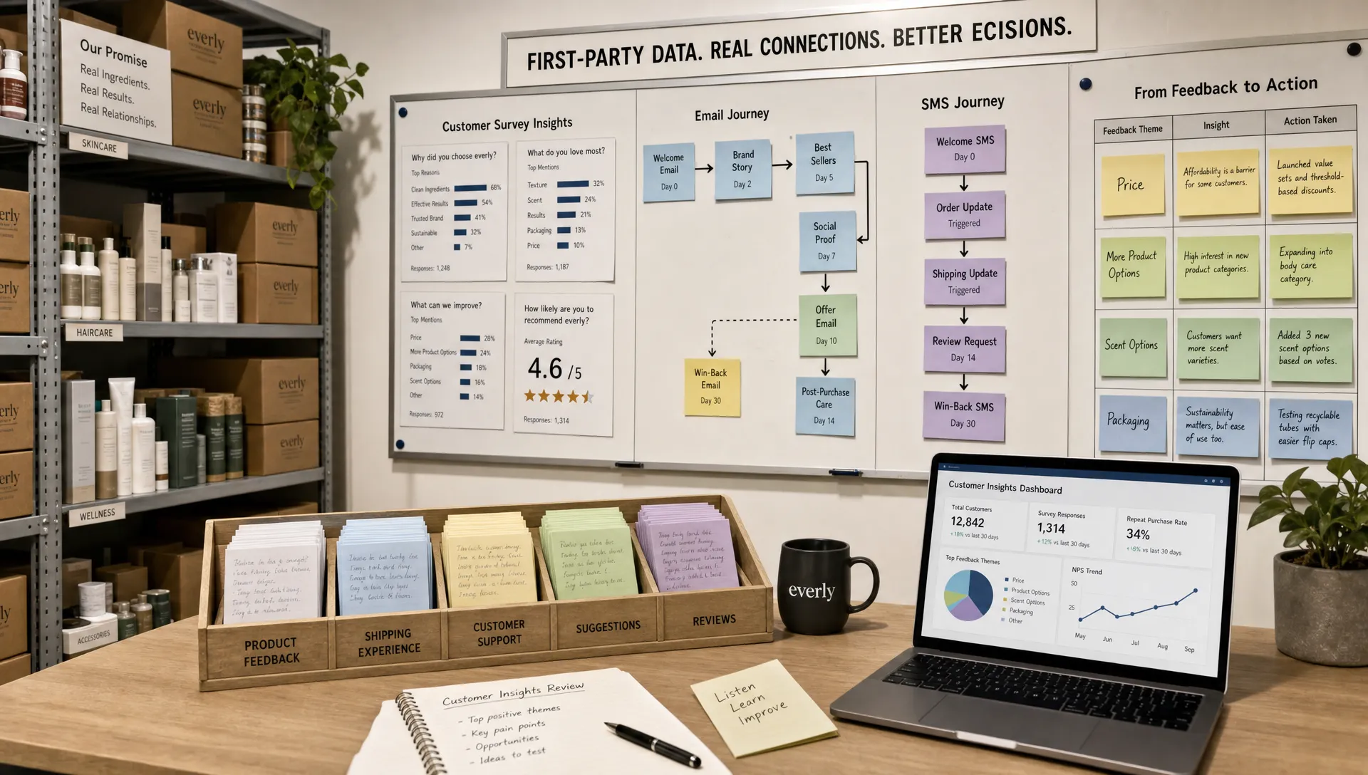
Before you rewrite your site or create a new bundle, find where shoppers are dropping off. Conversion rate optimization is most effective when it starts with evidence instead of opinions.
Use analytics, session recordings, customer support tickets, post-purchase surveys and abandoned cart data to identify the friction. The Baymard Institute’s cart abandonment research has consistently found that a large share of online carts are abandoned, which is a reminder that checkout intent does not automatically become revenue.
Look for patterns such as:
- High product page views but low add-to-cart rate
- Strong add-to-cart rate but weak checkout completion
- Mobile conversion lagging far behind desktop
- Heavy use of the promo code field before abandonment
- Repeated support questions about sizing, ingredients, shipping, returns or product use
Each pattern points to a different fix. If shoppers do not add to cart, your product page may not be doing enough selling. If they abandon checkout, the issue may be shipping cost, payment options, delivery timing or trust. If everyone searches for a promo code, your site may be teaching visitors that the real price is hidden somewhere else.
Make value obvious before shoppers compare price
A shopper compares price when value is vague. Your page needs to explain why the product is worth buying now, from you, at this price.
This starts above the fold. A visitor should quickly understand what the product is, who it is for, what outcome it supports and why your version is different. For a fitness brand, that might mean clarifying training use cases, fabric performance or fit. For a supplement brand, it might mean explaining formulation logic, third-party testing or ingredient purpose without making unsupported medical claims. For a wellness brand, it may mean translating broad benefits into a daily routine the customer can picture.
A strong first screen usually answers five questions:
- What is this product?
- Who is it built for?
- What outcome does it help me achieve?
- Why should I trust it?
- What should I do next?
The language should be specific enough to reduce uncertainty. “High quality performance gear” is easy to ignore. “Training shorts built for heavy leg days, with a no-slip waistband and sweat-wicking liner” gives the shopper something concrete to evaluate.
This is where brand strategy and conversion overlap. Clear positioning does not just make the brand sound better, it helps buyers understand the purchase faster. OPTYO breaks down this relationship further in its guide to how brand strategy and marketing drive better conversion.
Use offer architecture instead of blanket discounts
If your product needs a stronger reason to buy, do not reach for a sitewide coupon first. Improve the structure of the offer.
Offer architecture is the way you package value, reduce risk and guide the customer toward the right buying decision. The price may stay the same, but the perceived value increases because the customer understands what they are getting and why it fits their need.
| Non-discount lever | Why it can lift conversion | What to watch |
|---|---|---|
| Starter kit | Reduces decision fatigue for first-time buyers | Make the kit genuinely useful, not a random bundle |
| Build-your-routine bundle | Helps shoppers see how products work together | Keep choices simple so it does not slow the purchase |
| Free shipping threshold | Encourages higher AOV without cutting product price | Model the fulfillment cost before launching |
| Value-added gift | Adds perceived value while protecting core price integrity | Use items with healthy margin or strategic sampling value |
| Subscription option | Converts replenishable products into routine purchases | Make skip, pause and cancellation terms clear |
| Fit, quiz or product finder | Increases confidence before add-to-cart | Keep it short and send users to a clear recommendation |
Sports and wellness brands can also learn from categories that sell experiences rather than just products. Event operators such as MTS Productions, which packages NYC nightlife experiences around tickets, VIP tables, birthdays and group nights, show how bundling, occasion-based positioning and clear package tiers can make an offer easier to choose without simply lowering the price.
For ecommerce, the same principle applies. A recovery brand can sell a “post-marathon recovery kit” instead of three unrelated products. A nutrition brand can create a “first 30 days” stack. An activewear brand can group products by training environment, such as hot weather runs, studio workouts or strength sessions.
The shopper is not only buying an item. They are buying a solution to a situation.
Turn product pages into sales conversations
Many ecommerce product pages are built like catalogs. They show photos, list features and hope the shopper connects the dots. Better product pages behave more like a skilled salesperson. They anticipate questions, remove doubt and build confidence step by step.
Start with product media. Show the product in context, not only on a clean background. If you sell sports apparel, show fit from multiple angles and on different body types when possible. If you sell equipment, show scale, storage, use and setup. If you sell wellness products, show packaging, serving size, texture or routine context.
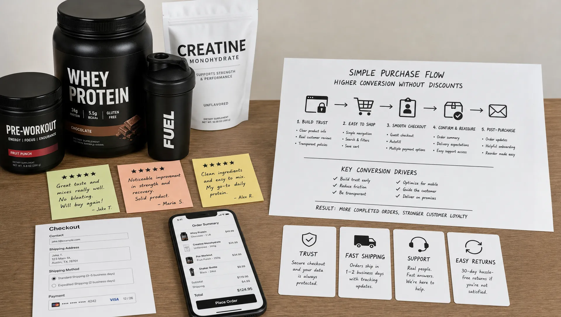
Then strengthen proof. Reviews should be easy to filter by concern, such as sizing, taste, training style, skin type or experience level. User-generated content can help, but only when it answers a real buying question. A blurry testimonial that says “love it” is less useful than a review explaining how the product performed during a long run, heavy lift or daily recovery routine.
Product pages should also handle objections directly. If shoppers ask whether leggings are squat-proof, put that answer on the page. If they ask whether a supplement contains caffeine, do not bury it in an accordion three scrolls down. If they ask how long shipping takes, show it before checkout.
Match landing pages to the traffic source
A common conversion mistake is sending every visitor to the same product page. Not all traffic has the same level of awareness.
Someone searching for your brand may only need a fast path to purchase. Someone clicking a cold paid social ad may need education, proof and a clearer explanation of the problem your product solves. Someone coming from an influencer post may need message continuity, so the landing page should reflect the claim, use case or product angle that drove the click.
Message match matters because it reduces mental friction. If an ad promises “plant-based protein that mixes smoothly in cold water,” the landing page should show that claim quickly, support it with proof and make the next step obvious. If the page opens with a generic brand story, the visitor has to work harder to confirm they are in the right place.
Dedicated landing pages are especially useful for campaigns built around specific audiences, products or objections. OPTYO covers this in more depth in its article on how a landing page agency can lift conversion rates.
Remove checkout friction without training shoppers to hunt for codes
Checkout is not the place to introduce surprises. By the time a shopper reaches checkout, the job is to preserve confidence and make completion easy.
The biggest friction points are usually practical: unexpected shipping costs, unclear delivery windows, limited payment methods, forced account creation and too many form fields. On mobile, small inputs, slow load times and clunky address fields can quietly drain revenue.
One detail many brands overlook is the promo code box. A large, highly visible promo field can send shoppers away to search for coupons. Some will find expired codes, some will get distracted and some will decide not to buy unless they find a better deal. You do not have to remove the field entirely, but you can reduce its prominence, use “gift card or promo code” language or reserve discount entry for customers who actually have a code.
Trust signals also matter near the final step. Clear return policies, secure payment cues, delivery estimates and support access help shoppers finish the order without needing a coupon to feel safe.
Use creative and email to pre-sell the purchase
Your conversion rate is shaped before a visitor lands on your site. Paid social ads, search copy, influencer content and email flows all frame the purchase.
If your ad only sells a discount, the visitor arrives expecting a bargain. If your ad demonstrates product use, handles an objection or shows a specific customer outcome, the visitor arrives with more context. That context can raise intent before the page ever loads.
For sports, fitness and wellness brands, strong pre-sell creative often includes product demonstrations, comparison angles, founder explanations, coach or athlete education, customer routines and objection-handling content. A running gear brand might show why a pocket layout matters on long runs. A supplement brand might explain when to use a product in a training day. A recovery brand might compare its product to common alternatives.
Email can do the same job without relying on endless coupon reminders. Welcome flows can tell the brand story, explain best sellers and guide new subscribers to the right product. Abandoned cart flows can answer common objections, show reviews and clarify shipping or returns. Post-purchase flows can improve usage, reduce buyer’s remorse and increase the chance of a second order.
Run tests with profit guardrails
Conversion rate is useful, but it should not be the only metric you watch. A test that increases conversion by pushing low-margin purchases, increasing returns or lowering AOV may not help the business.
Track conversion alongside revenue per visitor, AOV, gross margin, contribution margin, refund rate, subscription uptake and repeat purchase behavior where relevant. The right metric depends on your business model, but profit needs a seat at the table.
Good non-discount tests include product page headline clarity, offer bundles, review placement, sticky add-to-cart behavior, shipping threshold messaging, product comparison modules, checkout copy and landing page message match. Test one major idea at a time when possible, and give the test enough traffic to produce a meaningful read.
If you need a structured process for prioritizing and measuring these changes, OPTYO explains what to expect from an ecommerce conversion rate optimization agency, including audits, testing roadmaps and performance measurement.
A 30-day sprint to improve conversion without discounts
You do not need to rebuild your entire site to start. A focused month can reveal where the biggest opportunities sit.
| Week | Focus | Actions | Success signal |
|---|---|---|---|
| Week 1 | Diagnose friction | Review analytics, heatmaps, support tickets, reviews and abandoned cart behavior | Clear list of top conversion blockers |
| Week 2 | Improve product pages | Rewrite above-the-fold messaging, improve proof, answer common objections and clarify shipping or returns | Higher add-to-cart rate or lower product page exit rate |
| Week 3 | Upgrade offers | Test bundles, starter kits, quizzes, gifts or free shipping thresholds | Higher revenue per visitor or AOV without margin damage |
| Week 4 | Fix checkout and retention flows | Simplify checkout, reduce promo code hunting and improve cart or browse abandonment emails | Higher checkout completion and recovered revenue |
The key is to avoid treating every issue as a price issue. Sometimes shoppers need clearer proof. Sometimes they need a better path to the right product. Sometimes they need reassurance that returns are simple or that the product will arrive before an event.
When those pieces improve, conversion can rise without sacrificing the pricing power you worked to build.
Frequently Asked Questions
What is a good ecommerce conversion rate? A good ecommerce conversion rate depends on category, price point, traffic source, device mix and brand awareness. Instead of chasing a universal benchmark, compare performance by channel, product type and customer segment, then improve against your own baseline.
Can discounts still be part of a profitable ecommerce strategy? Yes, but they should be used intentionally. Discounts can help with inventory, loyalty campaigns or specific tests, but they become risky when they are the main reason customers buy.
What is the fastest way to improve conversion without discounts? The fastest wins often come from clearer product page messaging, stronger proof, better shipping transparency and fewer checkout surprises. These changes reduce hesitation without cutting price.
Are free shipping and gifts just another form of discounting? They are incentives, so they still affect margin. The difference is that they can protect your core product price and increase perceived value, especially when they raise AOV or introduce customers to products they may buy again.
How should I measure non-discount CRO tests? Measure conversion rate together with revenue per visitor, AOV, contribution margin, refund rate and repeat purchase behavior. This prevents you from celebrating a higher conversion rate that produces weaker profit.
Build a higher-converting ecommerce brand without racing to the bottom
Better conversion does not have to mean cheaper products. For many ecommerce brands, especially in sports, fitness and wellness, the bigger opportunity is clearer positioning, stronger offers, better creative, sharper landing pages and a smoother checkout experience.
OPTYO helps D2C and CPG brands improve growth through performance marketing, conversion rate optimization, creative, email, SEO and brand strategy. If your next stage of growth needs more profitable conversion instead of another round of discounts, it may be time to tighten the full funnel.